Don’t you like new things? Well then you’re going to be excited with the newest Admin features designed to make your AMPT lives easier, get more valuable insight from AMPT, and make the most of your experience with your employees.
Key features we’re excited to release:
- Multi-media Bulletin Editor
- Help Video Tours
- Themes
- Nudge and comment editing
- Survey functionality and reporting features
To learn more about those features (and others) as well as ways other users are taking advantage of these features, just scroll below for full information. Don’t need the overview and want to see it now? LOG INTO YOUR AMPT
Bulletin Editor:
The bulletin editor feature can help you take your internal communication game to the next level. From sharing critical updates for your entire organization in the moment, to picture or video rich communications about training, we’ve created the bulletin editor with team communications in mind.
Ways others are using the bulletins feature:
- Training opportunities
- Notices about upcoming important dates
- Team function or event planning
- Internal Job postings
- Company wide celebrations or recognition
- Newspaper or News articles about the organization
CREATE BULLETINS WITH MORE STYLE AND FORMATTING OPTIONS

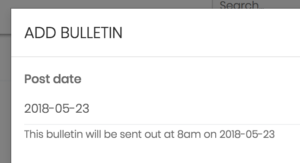
SELECT WHICH GROUPS OR DEPARTMENTS NEED THE INFO, AND FUTURE DATE THE POST TO MANAGE MULTIPLE POSTS AT ONCE

INSERT LINKS TO OUTSIDE SITE

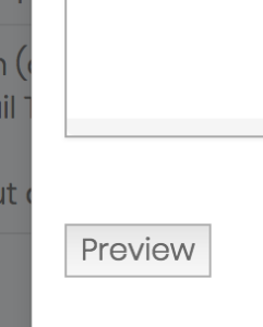
PREVIEW YOUR WORK BEFORE POSTING.
There are even more features to add and change the formatting of your font to create dynamic and engaging bulletin posts.
LOG INTO YOUR AMPT AND TRY IT OUT
NEW VIDEO TOURS
LOCATE THE ? BUTTON ON YOUR NAVIGATION BAR TO ACCESS HELPFUL VIDEOS AND STEP BY STEP TOURS TO LEARN HOW TO USE AMPT.

LOG INTO YOUR AMPT AND TRY IT OUT
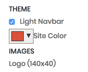
THEMES:
IN THE ADMIN SECTION ‘CLIENT SETTINGS’ SELECT NAVIGATION BAR COLORS AS WELL AS PLATFORM ACCENT COLORS THAT BEST BRING YOUR ORGANIZATION’S BRANDING TO LIFE WITHIN AMPT.
NUDGE AND COMMENT EDITING
ALL POSTS ARE NOW EDIT FRIENDLY!

SURVEYS AND SURVEY REPORTING
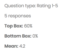
With our new Survey reporting feature you can now take the insight on your Login or Pulse surveys to a new level. Now you can filter results by department or location, as well as compare results across your entire organization. We’ve also added Top Box and Bottom box scores, along with Mean. These standard basic metrics for surveys allows you to see where your teams compare and vary across your entire organization.
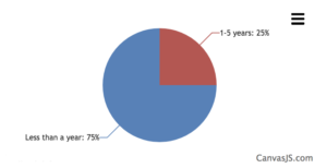
Lastly, we’ve added new graphical illustrations of your results dependent on the types of survey questions you ask. Now, if you choose a multiple choice questions, your results will show up in a pie chart or for a standard 5-point scale it will show a bar chart.
Please contact us for a full demo of the new surveying features, as well as best practices, question ideas, and help to organize your first engagement survey.
FILTER YOUR RESULTS BY DEPARTMENT OR LOCATION AND THEN COMPARE THE RESULTS TO OTHER DEPARTMENTS OR LOCATIONS.

TOP BOX, BOTTOM BOX, AND MEAN SCORES:
DIFFERENT GRAPH TYPES DEPENDENT UPON QUESTION TYPE
